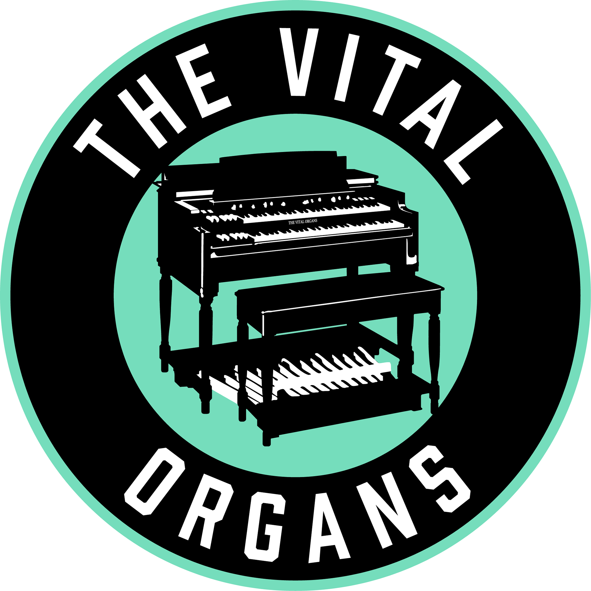
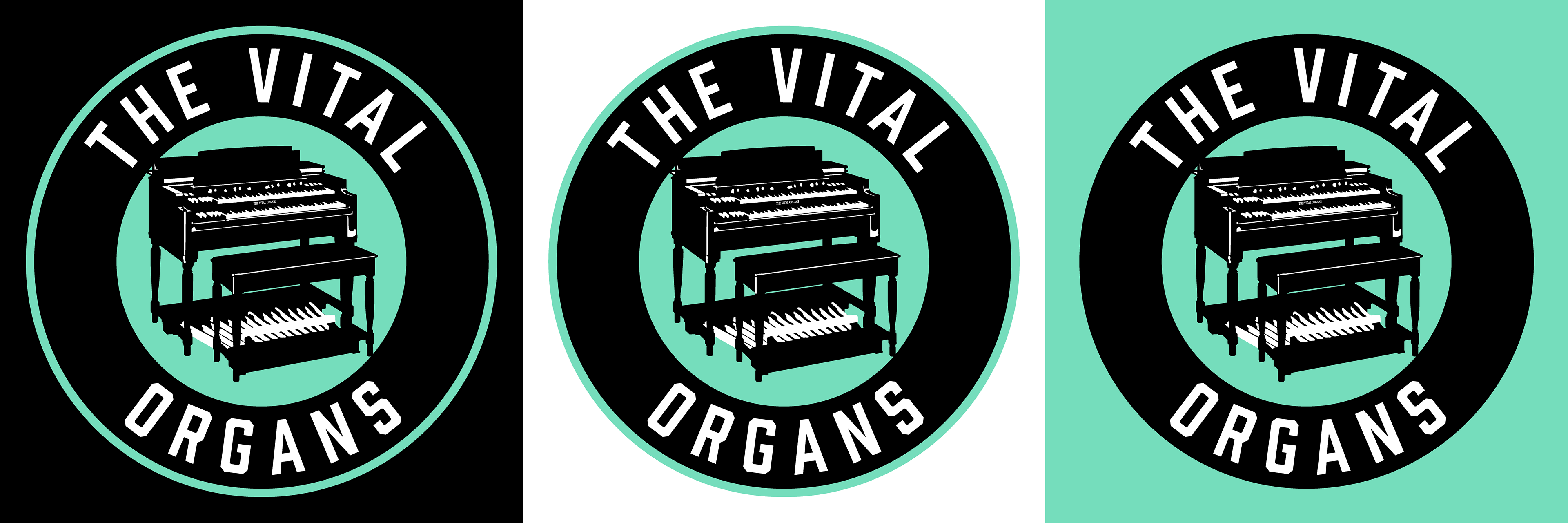
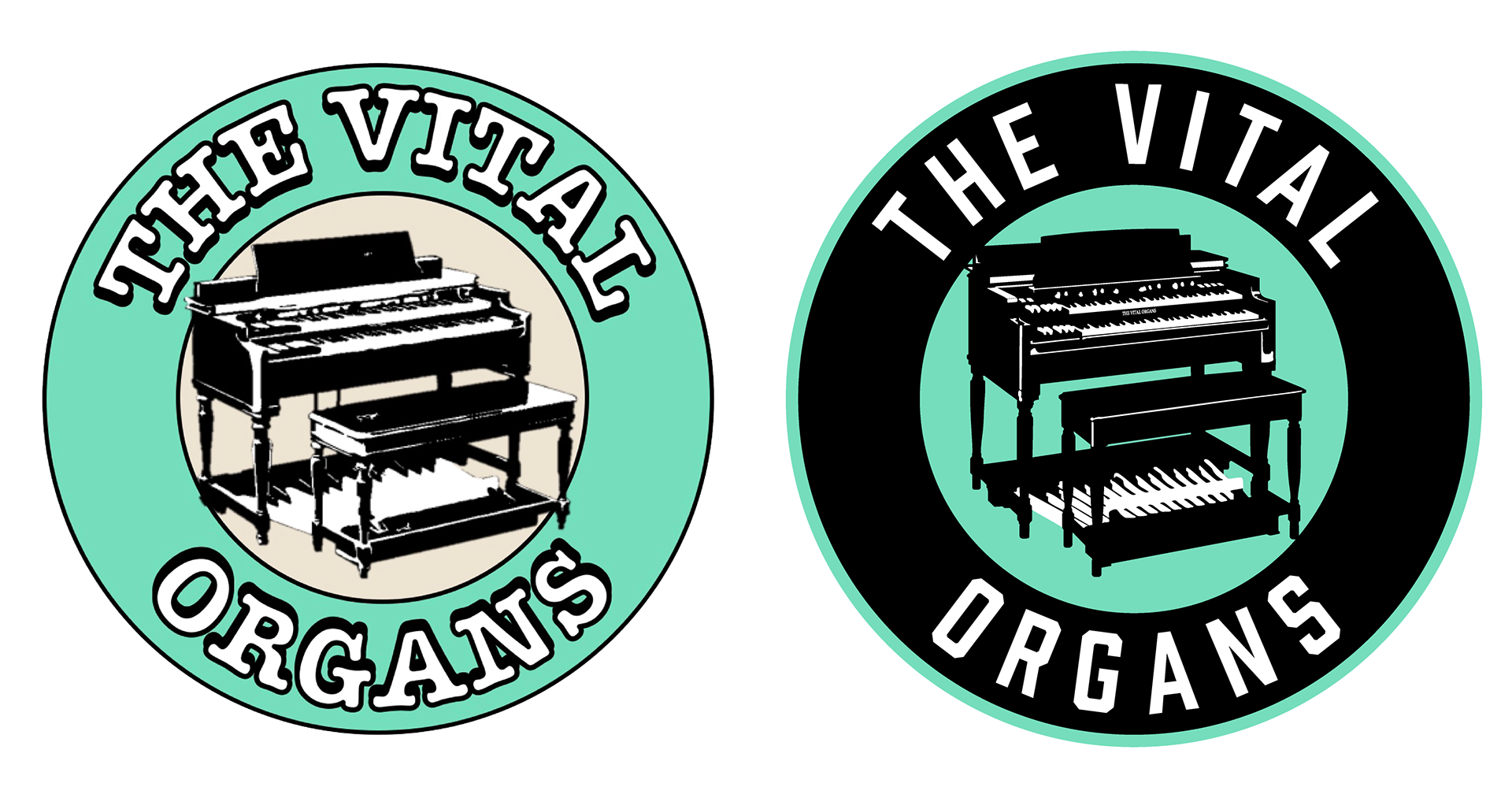
The logo on the left was the first logo that I ever designed. I created it on Microsoft Word from a photo of an organ, two circles, and two text boxes. Given that I created it with no experience whatsoever, it doesn't look as bad as you might think. Of course the organ looks messy and blurry and the font looks a little childish, but the logo had character and represented the music we play. I was satisfied with my creation, but after years of looking at its flaws, I decided that it was time for an update. I wanted to keep the key elements of the old logo, as I didn't want to lose the brand recognition we have built up with it. The new design features a much better looking organ, an increased use of black, and text that is cleaner and more legible. This new design still contain